Thursday, 20 November 2014

Editing - Raw Footage, Colour Correction + Chroma Keying


After editing
I used colour correct, saturation and contrast manually to fix the juxtaposition that was created by natural weather. The Shadow Selves are known as the dark villains in this short film and so the saturation needed to be brought down so I didn't have a clash which might confuse audience members. I also added more white to the footage to wash out my characters slightly to make them appear slightly dead. Also, by bringing down the saturation you get less of a bright green and more dark, shallow tones. I also did this towards the beginning of the film  - I took more colour out as colour conveys happiness and feeling, where as the girl has insecurities and so by taking the colour away it represents her mood at the beginning of the film and the transformation towards the end.

The shot below is from the beginning of the short film. As you can see, the footage looks drained and lifeless. I wanted to portray this at the beginning of my short film because the girl is suppose to show a dramatic change after going into the daydream. I also link this later on to the Shadow Selves, where the same grading was used to show the link between the girls depression and the cause of her depression (the Shadow Selves).
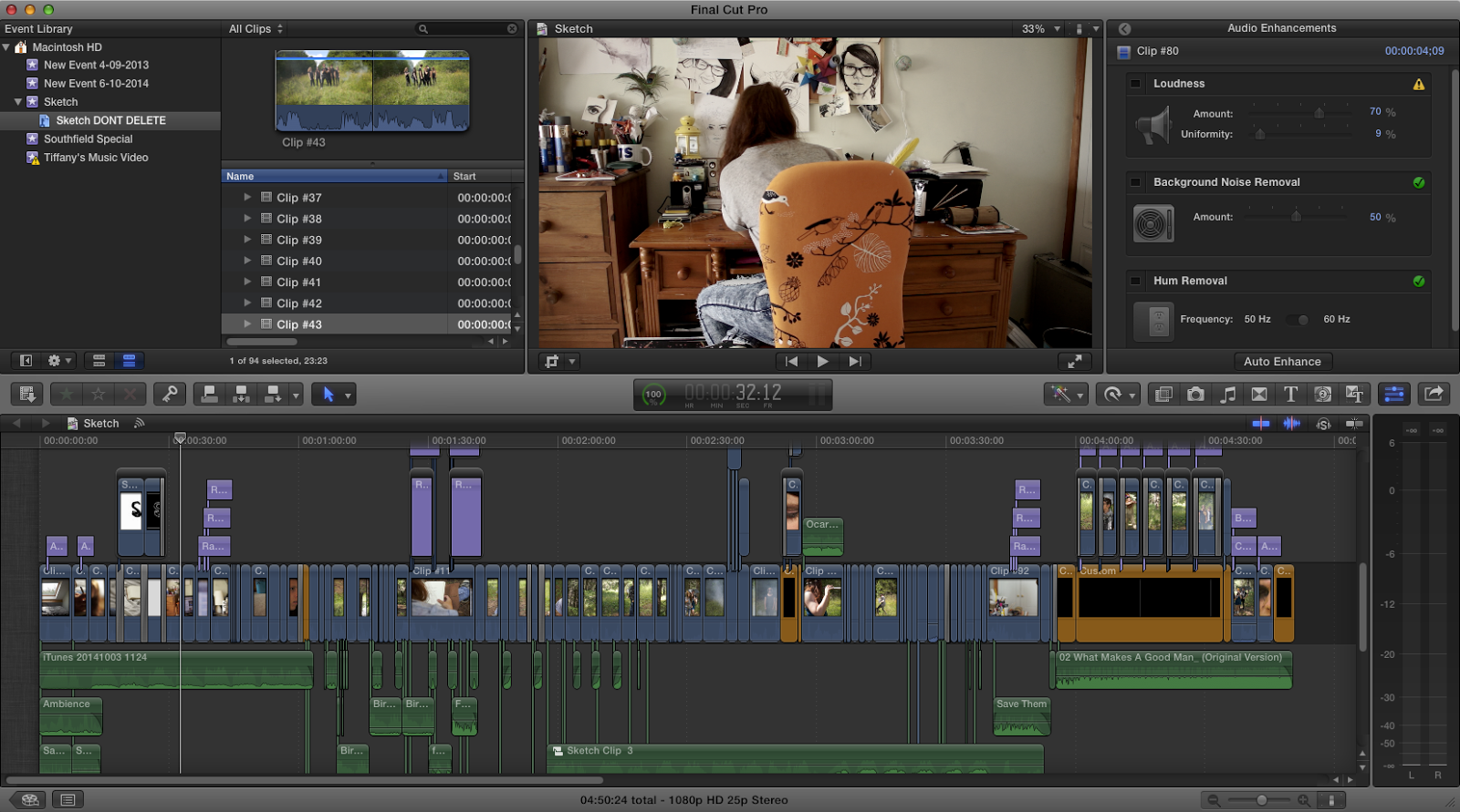
When the girl is sitting on the chair I took a lot of saturation out of this. The camera I was using (Sony 5n) picks up a lot of vibrant colours and so this made for more editing later on. By lowering the grey and whiter tones I was able to still keep colour whilst making the room appear less colourful without the use of filters or layers which can make a film appear unprofessional.

Chroma Keying

Way before producing any kind of special effects on Adobe AE I needed to Key out the green screen, add in the background and colour correct so it matched a similar colour to the background. We were able to gain a warmer tone to the actor by using stage light which gave an overall golden glow and gave it the feeling that he was outside. Applying a video as the background was the easy part. You just apply the chroma key layer over the green screened video and it cuts out the colour that you select. You then pop a video underneath and it shows up in place of the green screen. The problem that occurred, however, was that because we used fabric as our green screen and not a painted wall, some areas of film became darkened from the shadows in the fabric. I managed to solve this through trial and error. By expanding the Chroma leeway into more turquoise colours as well, and allowed a higher spill level to fill in the shadows. I needed to do this with every different angle and camera shot to make sure that it was suitable for Adobe AE.


Monday, 17 November 2014

Magazine Article and Audience Feedback

My target audience feedback:


Kayleigh - "It's a little bit crowded on the left hand side, maybe re-size some of the quotations. I do like, however the use of images and they inform the reader what genre of film it is at first glance. Possibly add some reviews on the left had side of the page so people can see what other members of the audience think. I really like the quote up at the top of the right hand page and the change of colour to highlight different parts, and I also feel the images fit well with the style of magazine.


Katherine - "I like the border as it looks professional, the colours and house style are consistent and is laid out well. I think there is a little too much white space around the main bulk of the text which could be changed by the layout of the text"


Does it look professional?
Yes - 9
No - 0
Sort of - 1

Saturday, 15 November 2014

Analysing a Film Magazine Article


When analysing film magazines I need to look at not just the layout but also the content. This first magazine I will be looking at the layout and then chose another to study the content to help me create a professional and interesting looking film magazine double spread article. 

Firstly, when studying the layout of images on this page, they vary in size. My eyes are immediately drawn to the top image because it holds the most colour but is also the largest and so when creating my own magazine article I need to think about how the size of my images will effect my audience. I need my audience to be able to flick through a film magazine and stop at this page and be drawn to the images and layout before they even read a title or paragraph. I also need to think about with photos will best represent my short film and which could possibly let the audience know of the genre before they read the synopsis of the film. Some good images I could use would be one of the laser gun to show action, one of the Shadow Selves to show danger, and possibly some of me drawing as they are the main parts to my short film.

The second this I notice when looking at this article is the amount of white space. I want to have a house style to my magazine and I feel this film magazine doesn't have an obvious house style. There is a lack of colour which I also don't like about this article.Although the lack of colour on the pages means that our eyes are drawn more so to the images, I find this article dull to look at and so therefore would not catch my attention when looking through a magazine. When styling my magazine I could possibly create a border of colour or something just to give it a little edge over this article. The white space in between the columns of writing is even and consistent through out the article, I need to take this into account when creating my own magazine article. 

Friday, 10 October 2014

Adobe AfterEffects


The majority of short films don't need to have much added to them in terms of special effects as the plot line doesn't usually become in depth enough in that short amount of time. Even though my short film is just scraping an idea that could go much more into detail if more time was allowed I still wanted to have a go at using Adobe AfterEffects and all the doors it may open for my short film. There was just one scene that I wanted to apply effects to and this was, what I liked to call it, the "Jetpack Shoot 'em Up" scene, where The Spaceman flies into the air with his jetpack, aiming his gun at the on coming Shadow Self and then firing 3-5 shots and therefore killing them and destroying an insecurity. The gun he is using is a spray painted Nerf gun and so no special effects would have to be added with that, and the simple green screen and chroma keying in Finalcut Pro could be done at school... so the only main thing that needed to be added was the lasers coming from the gun (or some form of ammunition). I've never really used Adobe AE before, only to create the 'writing title' at the beginning of my film which took a while. Online tutorials would be my best way to get started with this and so I found the simplest 'Laser effect tutorial' I could find. Although there are effects already in Adobe AE I wanted to create something different. I first went into Adobe Photoshop and constructed my own laser looking beam. This was created in a PNG file so no background would be visible. To make this I took 1 rectangle, filled it in white before giving it a blue haze around the sides. To curve off the ends I then placed one circle on each end to give it the typical laser shape.

I transported this in Adobe AE then and created my first composition with my already edited green screen footage. The gun jolts 4 times and I need to track this motion to allow the beam to follow from these shots. The tracking can be done by adding a layer and applying a 'Track Motion'. Two boxes and an x in the middle of them will appear and you need to rearrange it to be able to fit the entire gun inside the 1st box, the barrel of the gun in the 2nd box and the middle of the barrel must have the x in it. The x in the middle I noticed will jump about places if shape or sudden movements are used and so when pressing play to watch each frame you always need to make sure the x is in the middle of the barrel.

The next part I felt was the most difficult out of the whole thing. I needed to layer the PNG image of my laser and tick the box saying I wanted it to be able to move as a 3D object. I also needed to unclick the padlock by the layer of the laser so I could move it around freely at different angles. Next I went through each frame to establish where the laser starts and disappears, then splitting this first layer into 3 more layers for each gun shot. Now that the laser was matched up to the tracking and split into 4 layers in total (1 for each gun shot) I could now go about moving the laser from one place to another. In simple words there are two dots (one on the barrel and one off the actual footage) and the laser starts from one  and moves to the other by the change in length of the laser. BUT! You have to go through each frame again and adjust where you want it to ago, adjust the XYZ axles to move the laser and change the angles, but then add effects to this like 'feathering' which can change how much the edge of you laser beam fades into the background. Quite a few times I missed out steps and indeed I did get very frustrated with AE but the end result I received was better than I could have hoped for, especially for a beginner.

Monday, 6 October 2014

Equipment Needed

This list will remind me what to bring when filming my short film. I've learnt from past experience that it is crucial to bring all the equipment needed and items that could help in case of an emergency.
Items I need to bring:

  • 2 Sony 5n cameras
  • 2 tripods
  • Smoke emitters
  • Matches
  • Camera lenses
  • Camera lens adapter
  • Penny board (for tracking shots)
  • Props (2 swords, 1 jetpack, laser gun, bow and arrows, stunt flute, book and pencil)
  • Face paint
  • Water
  • Paint brushes and sponges
  • Food
  • Backpack
  • Reflector (silver disk that reflects light)
  • Boom mic and wind breaker
  • Storyboard (for shot and story reference)

Saturday, 4 October 2014

Ancillary Task 1 - Poster


After having this poster shown to a diverse range of people on a school open evening, I was able to gain immense feedback from these people even though they weren't my target market. The majority stated that it looked professional and could be used for a film due to the billing block and layout of the poster.

Thursday, 2 October 2014

Applying Billing Block and Logo to Poster

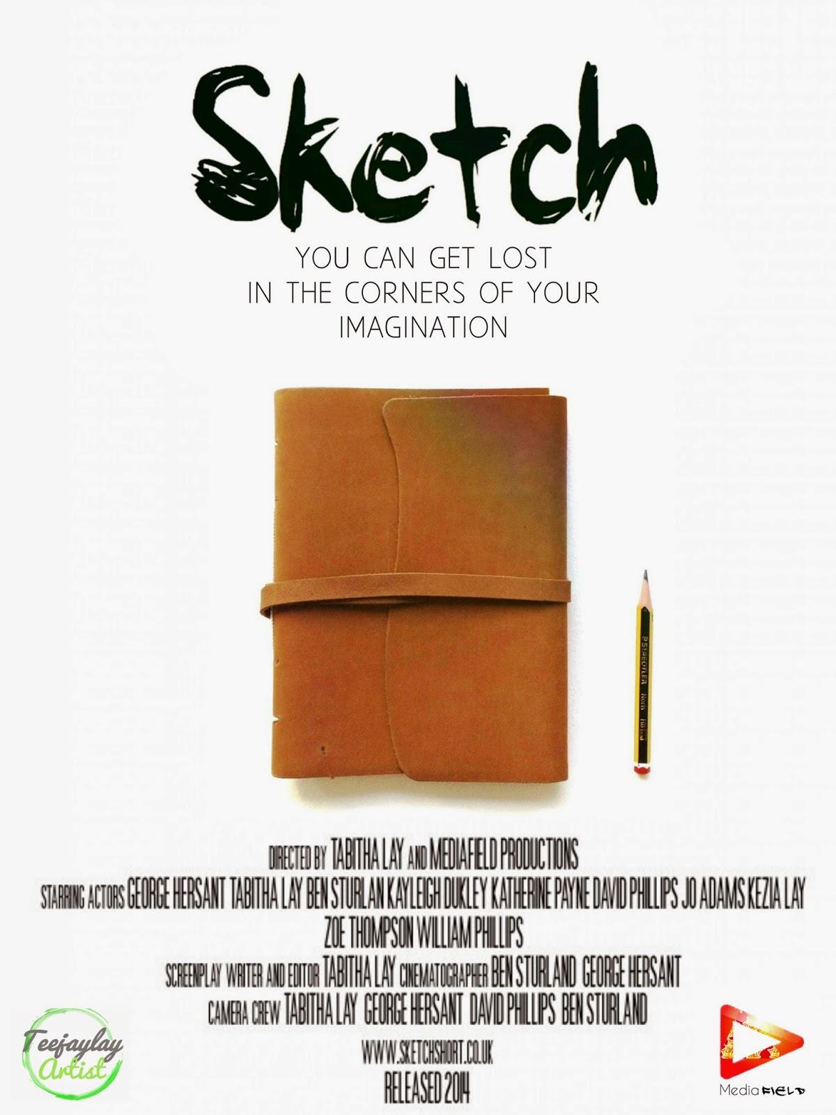
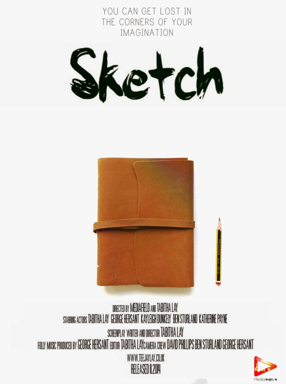
I wanted my posters to be a little different from the others out there and stand out, catch the attention of my audience. The majority of film posters follow conventional tropes, for instance they always have the main characters on the front, the name of the film, the billing block, logos and a tagline. Although I want my film poster to look as professional as possible I don't want to be lost in the crowd of other typical film posters. I believe that the best way to do that is to know have unfamiliar actors on the front cover but to have the main prop, the prop which creates the whole story and the film couldn't work without. The sketchbook and pencil are what brings the characters to life, what tells the girl how to defeat her inner demons and be free. The white background and the bold black title I feel makes the whole thing more memorable and makes the book and the pencil stand out more due to the fact that they are the only piece of colour on the poster. 
Bellow these posters will be a survey I have taken to investigate which poster my target audience prefers, therefore giving my film the best possible start by giving the correct information to my audience.


Myself - I prefer the last version as I get both logos on the poster, a decent billing block and a tag line. I prefer the tagline being underneath the title as it seems to flow better.

Kayleigh - I prefer the third one because I like the fact you get the tag line before the title.

Katherine - I don't like the second one because the writing doesn't seem to be in the right place and doesn't look correct, I don't like the 3rd because there is too much space between the title and the tag line. I do however like the 1st one because the writing sticks to a constant style and the 4th one because  everything seems to be spaced out correctly and I like the logos.

Simran - I like the 4th design because it's evenly spaced out

Ben - I like the 3rd because the tagline is before the title therefore allowing me to understand the theme of the movie before I see the title and the focal point seems to be the title.

Meghan - I like the 4th design because I prefer the title above everything as it draws your eyes to it first. 

Chloe - I prefer the second as it's simple and to the point.
Overall, after research into the target market and how they view the media of films I have decided that poster 4 is the best way to advertise my short film as it portrays the plot of my short film and gives all the information a short film poster needs to inform my target audience.

Wednesday, 1 October 2014

Rough Posters

By taking some screen shots from my film I am able to create a rough idea of what I want my posters to look like. Of course the shape of these posters wont be the desired shape due to the quality and the fact I'm using screen shots but it gives me a basic idea on editing and what the poster may look like when real photos are taken. I will still need to add things to these posters such as billing blocks, logo/company name and so on but this will start to give me an idea of what I want my posters will look like and gives me a chance to play around with different colours and layers before settling on a final design with the real images.
My first idea was to take a picture not of the main character but the main prop in the story, the item that causes all of this to happen. The book and pencil is what The Girl uses to create her army to defeat the Shadow Selves and therefor plays the biggest part in the film. I wanted to keep the background simple to leave the audience wondering and imagining what the film could be about and therefore leaving them intrigued. I spent a long time deciding over which font I wanted to use for my title. I needed it to fit with the style and plot of the short film without it becoming too messy. Some fonts where too elaborate and some where too difficult to read, but this one seemed to fit the bill as people can read it clearly and matches the idea of sketching. I also needed to think about a slogan or tagline to make people remember my short film but also to give a little more information on my short film. I had thought about other taglines such as 'Sketch yourself free' or 'Drawing is the salvation', but I felt it needed to be more about The Girl's imagination instead of drawing as that is already given away in the title. I then applied this all to some screen shots to get a rough idea of what it might look like.


Tuesday, 30 September 2014

Researching Film Posters

To allow me to create a conventional and convincing short film poster I need to research how others have made theirs. This may be difficult due to the various short film posters out there made by students such as myself. To make sure that these film posters are genuine I will search movie titles on IMDB (Internet Movie Data Base). 
I know I want my short film to be in the genre of adventure, showing my creativity through each second. YouTuber is a vast community filled with creative creators, along with some amazing short film creators that don't get the full credit they deserve. I have watched many short films, but when thinking of creativity and adventure short films my mind immediately turns to PJ Liguori YouTube short film director and animator. His films, although random and wild, contain the flare of creativity and adventure that I wish to portray through my film and poster. 
COLOUR BANDITS

PJ Liguori's short film 'Colour Bandits' is based on a creative idea of people called Colour Bandits who suck all colour from their path, craving the next day when they can absorb more colour, until this one bandit bites more than he can chew, too much colour is thrown at this bandit and therefore killing him by the overwhelming amount of colour and dye. The poster for this short film is simple, although I couldn't find this poster that wasn't a gif. I can analyse this poster. This poster is conventional with an unconventional twist. The twist being that it's a moving image, but along with this you also cannot see the main and only characters face. This is unconventional due to the fact the audience wants to be able to connect and recognise this character. This does however leave a little bit of mystery to the poster. The conventional side to this poster is the billing block, title, house style and actors name's. The billing block is the most important part of making a poster look like a real film poster as it tells the audience who made it, who's acting within the play, the editor etc. This allows the audience to see who created the movie and might then be more inclined to watch it. The house style of the font is very simple and bland which is in major contrast to the colour expanding behind the text. This allows all writing to be visible clearly but give a relaxing change to the intensity of colour. The conventional shape of the poster is portrait to fit the main character(s) in full view to the audience. 


Bridge to Terabithia

This feature film is about two children who become friends through their imagination, escaping the real world for the imaginary. I want to analyse this movie's poster as I want to create a short film that's filled with imagination and adventure.
This poster has the conventional billing block along the bottom below the title, the main characters in the image, the poster used portrait and a tag line. Firstly, the title fits the theme of the movie and the house style of the rest of the poster. When creating my poster I need to think about how I can link the theme of the movie to the title, with this poster the theme of the movie is mystical and magical which fits with the golden effect on the title. The colour scheme of the poster uses complementing colours to create a contrasting effect and therefor drawing the eyes of the target market towards the poster. I hope to have this effect with my poster to be able to get as much publicity as possible. CGI (computer generated images) was used for the effects of the fireflies and the moon, also layering different effects and items such as the tree, house, river and car. This image was most probably taken in front of a green screen and then each image layered over the top in an application. I wouldn't be able to do this myself as I don't have the training or the equipment, however I can edit the lighting, layering and colour of my poster to adjust it right and make it look more like a real movie poster.


 The Tea Chronicles

This short film, although not about imagination, uses imagination in the creating process. This idea is extremely original and work brilliantly as an overall concept. This short film is a psychological horror comedy about a new room mate who offers to make his new colleagues some tea but is unable to find any new sugar, but soon stumbles upon some very old granulated sugar. This out of date sugar soon turns Charlie, the main character, into paranoia about cups of tea. This, I believe, is an extremely imaginative way to look at a normal situation, turning a simple cup of tea into a comedic horror. This will help me to expand my thought on possible ideas on a short film and makes me understand that it can be the most simplest of situations, for instance a cup of tea or a daydream, into something completely out of the ordinary.
The conventions used within this poster are the title, house style, tag line and billing block. What isn't conventional from this is that the main characters aren't in this poster, but instead what the entire short film revolves around, the mouldy sugar. The sugar itself can't be classed as a character but can be said that it plays a very important role within this short film and is what makes this situation start in the first place. This would be good to make a poster a little different from the rest, just a little unconventional to make it different from the rest.

what I have learnt from studying all these posters is that they can all vary but the majority follow conventions which in turn make a poster look professional. These conventions include, a billing block, actor/talent names, title, tag line and main image of characters. All of this will be considered when making a poster for my short film to make it appear as professional as possible.

Friday, 26 September 2014

Director and Editor Darren S Cook

Darren S Cook is the founder of Scruffy Bear Pictures and has had vast experience in editing, directing and much more. Originally he worked in graphic design for CD and DVD cases but wished to learn more about what and how film and music was put onto these CDs and DVDs. He worked his way up by becoming a runner on set then slowly working his way up through cinematography, production, and then finally becoming his own director. What I didn't realise is that the director themselves don't do much apart from telling people what they want filmed and how they want it to look. It's the production crew who then have to make this idea a reality but adjusting lighting, camera angles, colour correction for the cameras etc.
 
He then went on to show us some of his own short films and short films he has worked on which included 'Wisdom', 'Three' and 'Little Angles'. He spoke about how not all short films need a budget and that he has worked on many short films that have had no budget at all. The camera I have been currently been using for filming my short film was used for filming 'Wisdom' and proves that you don't need expensive cameras to create a good looking short film. Another thing I learnt was that good sound is crucial. If the footage looks good, that's brilliant! But if the sound is poor or you can't understand what they are saying your mind distorts the image making it appear a poorer quality than it actually is, which could mean the difference between an investment from a company or nothing at all.

My favourite short film of his is 'Wisdom' due to the fact of the unusual story line and use of camera angles and hit of humour. The main woman within this short film owes a debt to the 'tooth fairy' and is reminded that she has nothing in life, everyone and everything running away from her. The spliced humour and horror in this makes it a brilliant short film. The humour was also written well, which will always remind me, that the genre I write about must be written well, and to only have actors speaking if they can act, otherwise it can make my short film look unprofessional.
 
Next he told us about tips and tricks with cameras. He told us that a brilliant short film can even be made with the camera on your iPhone or tablet and that there are many applications that are free that can help with the production of your short film. For example, Darren uses an app on his phone which tells you where the sun will be during the day, this can tell you where the shadows will fall and whether you will need extra lighting for the time of day you want to film. Another is Celtx which helps you create and plot out a storyboard and add images to get a clear idea of what you want for your short film. A trick he told us for smooth panning is instead of using a track, which is what people use on set to move a camera with gliding movements, use a penny board or skate board along with a piece of material or something to keep the ground smooth and flat.

All of this will aid any more filming I will need to do and is invaluable to my work. I will take what he told us and use it throughout my work from editing to camera work.
 

Sunday, 21 September 2014

Filming Experience?

I have previously been editing videos for YouTube for quite some time and so I have built up skills in which angles look better than others, natural lighting, rule of thirds etc. All of these skills will help me with my short film and the two videos here are ones I believe have helped me develop skill in slow motion, music, lighting, editing techniques, FinalCut Pro and colour editing. Although these videos have been created originally for other subjects they still apply with what I am trying to achieve, a professional looking short film with a diverse range of transitions and techniques.