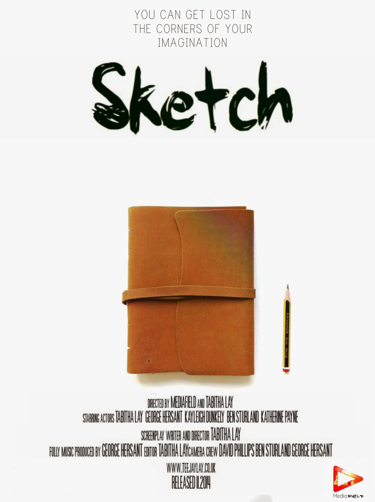
I wanted my posters to be a little different from the others out there and stand out, catch the attention of my audience. The majority of film posters follow conventional tropes, for instance they always have the main characters on the front, the name of the film, the billing block, logos and a tagline. Although I want my film poster to look as professional as possible I don't want to be lost in the crowd of other typical film posters. I believe that the best way to do that is to know have unfamiliar actors on the front cover but to have the main prop, the prop which creates the whole story and the film couldn't work without. The sketchbook and pencil are what brings the characters to life, what tells the girl how to defeat her inner demons and be free. The white background and the bold black title I feel makes the whole thing more memorable and makes the book and the pencil stand out more due to the fact that they are the only piece of colour on the poster.
Bellow these posters will be a survey I have taken to investigate which poster my target audience prefers, therefore giving my film the best possible start by giving the correct information to my audience.
Myself - I prefer the last version as I get both logos on the poster, a decent billing block and a tag line. I prefer the tagline being underneath the title as it seems to flow better.
Kayleigh - I prefer the third one because I like the fact you get the tag line before the title.
Katherine - I don't like the second one because the writing doesn't seem to be in the right place and doesn't look correct, I don't like the 3rd because there is too much space between the title and the tag line. I do however like the 1st one because the writing sticks to a constant style and the 4th one because everything seems to be spaced out correctly and I like the logos.
Simran - I like the 4th design because it's evenly spaced out
Ben - I like the 3rd because the tagline is before the title therefore allowing me to understand the theme of the movie before I see the title and the focal point seems to be the title.
Meghan - I like the 4th design because I prefer the title above everything as it draws your eyes to it first.
Chloe - I prefer the second as it's simple and to the point.
Overall, after research into the target market and how they view the media of films I have decided that poster 4 is the best way to advertise my short film as it portrays the plot of my short film and gives all the information a short film poster needs to inform my target audience.


No comments:
Post a Comment