Thursday, 27 November 2014

Audience Feedback

Whilst still editing my short film I thought it would be a good idea to get my Media Studies class to watch and say what they liked or would change about the short film Sketch. All these comments are anonymous as they were all written on a piece of paper but a lot have helped me change a few aspects of my short film.

- At the beginning, have one foot being placed over the doors ledge to show she's ready to take that step into her daydream.
- Love the good use of shots and green screen, the song during the credits adds to the kick ass theme. 
- Instead of a shoe, start drawing the sword as I was a bit confused. BUT I LOVED IT.

- The fading of the voices to the left and right speakers was brilliant! Made me jump.
- The Split screen -  how did you do it?

- The music throughout is BRILLIANT!
- The part where Ben (the guy in the jet pack) is in the air is good!

- Every single bit done with thought and precision
- Felt so much longer than 5 minutes - effective use of time

- The shots are precise and the music adds really good atmosphere.
- Sound effects are really good when the drawings are done

- Filming is so clear + precise, flows so well! Love the music

- Hardly anything to critique! Excellent choice of music and shots. bit confused whether you draw the characters or not. Maybe show that you draw them in a shot?

- The music is really effective and the dialogue works well. Only thing I noticed was when the characters appeared the music could cut a bit quicker. Otherwise AMAZING! You could fade out the music at the end as well.

Tuesday, 25 November 2014

RAW sound

Of course it would be impossible for me to produce all the music within my short film given the time BUT I've have recorded foley sounds and edited them within GarageBand to create layers and remove background sound. I did record some background music for my short film but I didn't compose it. Within the beginning of my short film there is some relaxing background music before the theme song of this film is used. I record this on my phone from a game I play which uses a lot of different sounds and music. From this game also I recorded the 'whoosh' drawing sound that is used every time a character is brought to life and when she awakes from her daydream.
Some of the whispering when the book talks to the girl was recorded myself and edited myself within GarageBand. I layered each different piece of speech before applying a 'clear vocals' layer, a 'luna bounce' layer and upped the Master Echo.
Below are the RAW recordings:


Editing - Sound


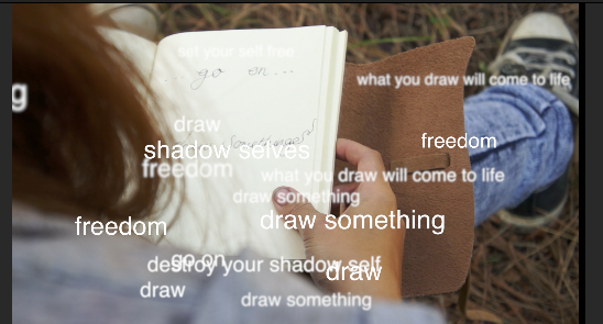
When developing the sound effects and possible background music for my short film there were many possibilities to consider and wasn't fully planned before all the editing. For instance, when first creating my short film I wanted to just add writing over the top to make it appear that the book was speaking to the main character. This idea originally came from Sherlock when he deduces someone from one look.  I felt this effect would go perfectly with the idea I had in mind and so used this as inspiration. I later got audience feedback on this and many said it was a little difficult to try and read all the words on the screen. To make it easier for the audience I applied layered sound over the top of people whispering what the book wanted to say. I edited this sound to have echos and wisps of sound to create a slightly eire tone. I recorded about 3-5 sounds for each page (image below of when this happens) which I then 

layered slightly over one another to make each piece flow. When the girl turned the page a new set of whispers would be set off. To also add an interesting sound effect to these whispers I was able to edit the sound so it would bounce from the left earphone to the right. This was done by changing the sound equaliser for speakers of each track to play louder on one side than it does the other. This overall gives a 3D sound effect which has proven to be very effective with my target audience.
For diegetic sounds I recorded my own foley which was used for the girl walking through the woods, the pencil writing on paper at the beginning of the film and general ambience sound which I recorded all off my phone. Without diegetic sounds the film appears flat and unprofessional. Even in many silent films or music videos where the music track is the only source of sound they will still add some diegetic sound to make the film appear more full. Because these sounds weren't recorded through the use of a boom mic the sound contains background sound which can be heard through earphones when listening to this short film. This makes my short film appear unprofessional but I was able to make it slightly better but editing the sound and so it is a little less noticeable. Sounds I didn't create myself but still add to diegetic sounds are the bird sounds over the top and the laser sounds. I wasn't able to record the ambient bird sounds as my mic wasn't powerful enough to record my own and the laser sound was something I couldn't record or produce on my own and so I used sounds from Logic and GarageBand to help. With the laser sounds I needed to sync this up with the timing of the laser being shot and so for this I zoomed in quiet a bit to check that it was in time with the shooting. Even after this I went back ever so often to check that the sound matches up with the action. The same for the girl walking through the woods and turning pages, I always checked to see it the sound matched the action perfectly as out of time sounds can make a short film seem unprofessional.

The non-diegetic sound I used within the short film was the voice over whispers and the theme music. It took time to decide what music I wanted for my main theme music. Did I want epic battle music? Or something more slow and sorrowful? I couldn't really decide what music I wanted until I had edited the rough order of my film together to see whether the music would be long enough and whether it would suit different parts of the short film. The list below are a few links of the music I was considering for my short film but also sound effects that would help me with the ambience:


I went with the last one as it starts off graceful but when the low cellos kick in you can sense a small amount of danger.When the rest of the violins start it gave my chills and that's how I knew this was the right piece for my film as it has grace but also an epic middle section that I could link up to the battle scene that I needed to produce when the sketches and the girl meet the shadow selves for the first time. The other pieces of music were too far into the genre of action, where as this film is more adventure and so I wanted a piece that would create that sensation of adventure within the audience to make them feel and believe that they are actually with the characters. 

Thursday, 20 November 2014

Editing - Raw Footage, Colour Correction + Chroma Keying


After editing
I used colour correct, saturation and contrast manually to fix the juxtaposition that was created by natural weather. The Shadow Selves are known as the dark villains in this short film and so the saturation needed to be brought down so I didn't have a clash which might confuse audience members. I also added more white to the footage to wash out my characters slightly to make them appear slightly dead. Also, by bringing down the saturation you get less of a bright green and more dark, shallow tones. I also did this towards the beginning of the film  - I took more colour out as colour conveys happiness and feeling, where as the girl has insecurities and so by taking the colour away it represents her mood at the beginning of the film and the transformation towards the end.

The shot below is from the beginning of the short film. As you can see, the footage looks drained and lifeless. I wanted to portray this at the beginning of my short film because the girl is suppose to show a dramatic change after going into the daydream. I also link this later on to the Shadow Selves, where the same grading was used to show the link between the girls depression and the cause of her depression (the Shadow Selves).

When the girl is sitting on the chair I took a lot of saturation out of this. The camera I was using (Sony 5n) picks up a lot of vibrant colours and so this made for more editing later on. By lowering the grey and whiter tones I was able to still keep colour whilst making the room appear less colourful without the use of filters or layers which can make a film appear unprofessional.

Chroma Keying

Way before producing any kind of special effects on Adobe AE I needed to Key out the green screen, add in the background and colour correct so it matched a similar colour to the background. We were able to gain a warmer tone to the actor by using stage light which gave an overall golden glow and gave it the feeling that he was outside. Applying a video as the background was the easy part. You just apply the chroma key layer over the green screened video and it cuts out the colour that you select. You then pop a video underneath and it shows up in place of the green screen. The problem that occurred, however, was that because we used fabric as our green screen and not a painted wall, some areas of film became darkened from the shadows in the fabric. I managed to solve this through trial and error. By expanding the Chroma leeway into more turquoise colours as well, and allowed a higher spill level to fill in the shadows. I needed to do this with every different angle and camera shot to make sure that it was suitable for Adobe AE.


Monday, 17 November 2014

Magazine Article and Audience Feedback

My target audience feedback:


Kayleigh - "It's a little bit crowded on the left hand side, maybe re-size some of the quotations. I do like, however the use of images and they inform the reader what genre of film it is at first glance. Possibly add some reviews on the left had side of the page so people can see what other members of the audience think. I really like the quote up at the top of the right hand page and the change of colour to highlight different parts, and I also feel the images fit well with the style of magazine.


Katherine - "I like the border as it looks professional, the colours and house style are consistent and is laid out well. I think there is a little too much white space around the main bulk of the text which could be changed by the layout of the text"


Does it look professional?
Yes - 9
No - 0
Sort of - 1

Saturday, 15 November 2014

Analysing a Film Magazine Article


When analysing film magazines I need to look at not just the layout but also the content. This first magazine I will be looking at the layout and then chose another to study the content to help me create a professional and interesting looking film magazine double spread article. 

Firstly, when studying the layout of images on this page, they vary in size. My eyes are immediately drawn to the top image because it holds the most colour but is also the largest and so when creating my own magazine article I need to think about how the size of my images will effect my audience. I need my audience to be able to flick through a film magazine and stop at this page and be drawn to the images and layout before they even read a title or paragraph. I also need to think about with photos will best represent my short film and which could possibly let the audience know of the genre before they read the synopsis of the film. Some good images I could use would be one of the laser gun to show action, one of the Shadow Selves to show danger, and possibly some of me drawing as they are the main parts to my short film.

The second this I notice when looking at this article is the amount of white space. I want to have a house style to my magazine and I feel this film magazine doesn't have an obvious house style. There is a lack of colour which I also don't like about this article.Although the lack of colour on the pages means that our eyes are drawn more so to the images, I find this article dull to look at and so therefore would not catch my attention when looking through a magazine. When styling my magazine I could possibly create a border of colour or something just to give it a little edge over this article. The white space in between the columns of writing is even and consistent through out the article, I need to take this into account when creating my own magazine article.